
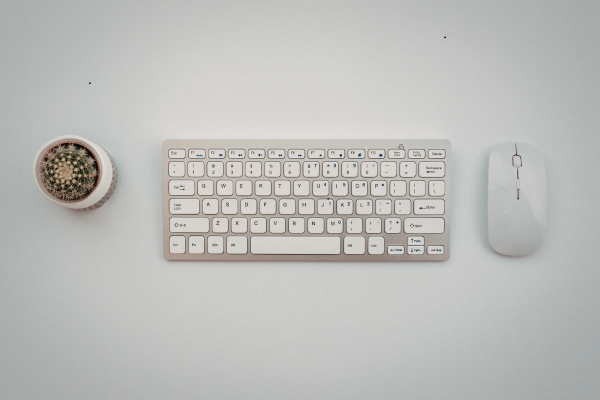
Minimalism in keyboards isn’t the absence of personality, it’s a different kind of statement. Where a maximalist build says “look at everything I chose,” a well-executed minimalist build says “look at how little needed to be here.” That distinction matters, because a lot of people confuse minimalism with simply being cheap or unfinished, when done well it’s actually one of the harder aesthetics to pull off precisely because there’s nowhere for mistakes to hide.
Here’s how to actually build toward it, rather than just ending up with a plain keyboard by accident.
Start With Restraint on Color
The single biggest mistake in attempted minimalist builds is using too many colors. A true minimalist palette is usually one or two colors total, often a single base tone with one contrasting accent, black and white, all-gray, or a monochrome set in a single hue. If you’re reaching for a third or fourth color “just for a little pop,” that’s usually the moment a build stops reading as minimalist and starts reading as understated-but-still-busy.
This is harder than it sounds, because most keycap sets are designed with multiple accent colors baked in by default. Finding a genuinely restrained colorway sometimes means specifically seeking out sets marketed as monochrome or blank, rather than picking a “mostly neutral” set from a colorful lineup.
Let Typography and Legends Do Less
Bold, colorful legends draw the eye and add visual noise, even on an otherwise neutral keycap set. Minimalist builds tend to favor subtle, low-contrast legends, dark gray text on black, or light gray on white, rather than high-contrast printing. Some builds go further and use blank keycaps entirely, no legends at all, which is a genuinely different typing experience (you’re relying entirely on muscle memory and touch typing) but creates an extremely clean, uninterrupted visual surface.
Blank keycaps aren’t for everyone, and if you’re not already a confident touch typist, they can genuinely slow you down while you adjust. If that’s a dealbreaker, low-contrast legends get you most of the visual effect without sacrificing usability.
Choose a Case That Disappears Into the Desk
A busy, textured, or brightly colored case competes with the minimalist keycaps sitting on top of it. The cleanest minimalist builds tend to use simple, matte cases in black, white, or a neutral gray, with minimal visible branding or badging. Aluminum cases with a bead-blasted or anodized matte finish tend to photograph and feel more “considered” than glossy plastic, though a well-chosen plastic case in a neutral tone works fine too, it’s really about consistency with the rest of the build rather than material snobbery.
Resist the RGB Instinct
This is the hardest one for a lot of people coming from gaming keyboards, where per-key RGB is treated as a default feature rather than an optional one. A genuinely minimalist build either skips backlighting entirely or uses a single, subtle, consistent tone (a soft white underglow, for instance) rather than reactive multi-color effects. If your board has RGB capability and you’re going for minimalism, the software setting matters as much as the hardware, dial it down to something closer to “off” or a single static tone rather than leaving default rainbow cycling active.
Keep the Desk Around It Equally Restrained
A minimalist keyboard sitting in the middle of a cluttered, colorful desk setup undercuts itself. The aesthetic works best as part of a broader commitment to restraint, a plain desk mat (or none at all), minimal visible cables, and a general absence of novelty items or decorations competing for attention. This is often the part people skip, buying a beautifully restrained keyboard and then setting it down next to a rainbow of gaming peripherals, which undoes a lot of the intended effect.
See a Minimalist Build in Practice
Reading about restraint is one thing, seeing it actually executed on a real board makes the difference between “plain” and “intentionally minimal” much clearer. This video walks through a genuinely minimalist custom keyboard build and explains some of the specific design choices behind it:
Minimalism Doesn’t Mean Sacrificing Sound or Feel
One misconception worth clearing up: going minimalist visually doesn’t require compromising on switch feel, sound quality, or build quality. You can absolutely pair a restrained, monochrome aesthetic with premium switches, proper foam dampening, and a satisfying deep sound, minimalism describes the visual language, not a budget constraint or a feel downgrade. If anything, the visual simplicity tends to make people notice the sound and feel more, since there’s nothing else competing for attention.
If you haven’t settled on switches yet, our guide on linear vs tactile vs clicky switches is worth a read regardless of which aesthetic direction you’re going, and if quiet is part of your goal alongside minimalism (a common combination for office-appropriate builds), our silent switches for open offices roundup pairs naturally with this kind of restrained visual approach.
Why Minimalism Is Genuinely Harder to Get Right
Counterintuitively, a maximalist build with a dozen bold colors and RGB effects has more room for individual choices to be slightly “off” without anyone noticing, there’s so much visual information that small inconsistencies get lost in the noise. A minimalist build has nowhere to hide. A slightly mismatched shade of gray, an inconsistent finish between case and keycaps, a cable that’s just a touch too colorful, all of these stand out far more starkly against a restrained palette than they would in a busy one.
This is exactly why minimalist setups that succeed tend to look deliberately considered rather than accidentally plain: every remaining choice had to actually earn its place, since there was nothing else around to distract from it.
The Bottom Line
Minimalist keyboard aesthetics come down to restraint applied consistently: one or two colors total, subtle or absent legends, a case that doesn’t compete with the keycaps, RGB dialed back or off entirely, and a desk environment that matches the same restrained philosophy. Done well, it’s one of the most striking aesthetics in the hobby, precisely because it takes real discipline to pull off convincingly.