
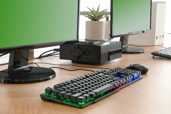
You’ve probably done this: bought a keycap set that looked amazing in the product photos, set it up next to your desk mat, and felt something was slightly off. Not clashing exactly, just… not quite clicking either. This happens more than people admit, and it’s rarely about picking “bad” colors individually. It’s about how those colors interact with everything else already sitting on your desk.
Here’s a practical framework for actually getting this right.
Rule One: Your Mat Is the Dominant Color, Not Your Keycaps
This is the mistake almost everyone makes early on. It’s tempting to treat your keycap set as the star of the show and build everything else around it, but your desk mat covers a much larger visual area and sits at the base of your setup, which makes it the actual dominant color whether you planned it that way or not.
A simple, borrowed-from-interior-design rule works well here: aim for roughly 60% dominant color (your mat), 30% secondary color (your keycaps), and 10% accent color (artisan keycaps, cable color, or small details). Pick your mat first, then coordinate keycaps to it, rather than the reverse. Trying to force a mat to match keycaps you already committed to is a much harder problem to solve.
Rule Two: Match Undertones, Not Just Hues
Two colors can technically be “the same” and still clash badly if their undertones don’t match. Warm white keycaps next to a cool-toned gray mat create a subtle visual tension that’s hard to name but easy to notice once you see it. Most budget “white” keycap sets actually lean warm/creamy, since it’s cheaper to produce consistently, while a lot of anime or digital-art desk mats lean cool because saturated blues and purples are common in that art style.
Before buying, hold your intended keycap color swatch (or a photo of it) next to your mat’s dominant tones and ask whether they feel like they’re from the same “temperature family.” If one leans warm and the other cool, that’s usually the source of an otherwise inexplicable mismatch.
Rule Three: Watch Your Value Contrast
Value refers to how light or dark a color is, separate from the actual hue. A pastel pink keycap set on a pastel pink mat might match perfectly in hue but have almost zero value contrast, and the result is a setup that looks like a flat, indistinct blob rather than a considered aesthetic, especially in photos.
If your keycaps and mat share a similar color family, introduce contrast through darkness or lightness rather than hue. A darker shade of the same color family as your mat, paired with lighter keycaps (or vice versa), creates definition without breaking your color scheme.
Rule Four: Pull Accent Colors From Small Details
Instead of trying to match your keycaps to the overall dominant color of a busy or detailed desk mat, look for small accent details within the mat’s design, a character’s hair ribbon, a background flower, a UI element, a subtle highlight color, and pull your keycap accent color from there instead. This creates a more intentional, “designed” feeling than matching the most obvious dominant color, and it tends to look more cohesive precisely because it’s less literal.
Rule Five: Match Your Surface Finish, Not Just Your Color
This one surprises people. Glossy ABS keycaps reflect light differently than the matte texture of most cloth desk mats and PBT keycaps, which can create a subtle finish mismatch even when the colors themselves are correct. Some people love this contrast intentionally, but if your goal is a cohesive, unified look, keeping your keycap material’s finish (matte PBT vs. glossy ABS) consistent with your mat’s texture tends to read as more put-together.
Rule Six: Check Your Actual Lighting, Not Just Daytime Light
Colors you carefully matched under bright daylight can look completely different under your actual evening setup, especially if you use warm LED strips or backlighting. Warm lighting shifts everything toward orange and yellow undertones, cool daylight shifts things blue. If you do most of your typing at night with ambient RGB or warm desk lighting on, check your color combinations under those actual conditions before committing to a full keycap purchase, not just in bright daytime light where everything tends to look fine.
Seeing These Principles Applied
Reading about color theory only gets you so far, seeing a full desk setup built with intentional color coordination makes the principles click much faster. This video walks through building a cohesive aesthetic desk setup from the ground up, touching on a lot of the same coordination logic covered above:
A Simpler Starting Point If This Feels Overwhelming
If color theory feels like a lot to think about for a keyboard, there’s a much simpler fallback: a neutral base (black, white, or gray keycaps) paired with a single small accent color, often just the Escape key or spacebar, gets you 90% of the visual payoff with almost none of the coordination complexity. A lot of the cleanest-looking setups online use exactly this approach rather than a fully custom multi-color scheme.
If you’re still deciding on the keycap material or profile before you even get to color matching, our PBT vs ABS comparison and our keycap profiles guide are worth reading first, since both affect how any given color actually reads once it’s on your desk. And if minimalism is more your style than a themed color scheme, our guide to minimalist keyboard aesthetics covers that approach in more depth.
The Bottom Line
Matching keycaps to a desk setup isn’t really about finding the “right” colors in isolation, it’s about understanding how your mat, your lighting, and your keycap finish all interact with each other. Get the dominant-to-accent ratio right, keep undertones consistent, and check everything under your actual lighting conditions, and most of the common mismatches sort themselves out naturally.